You’ve heard us talk plenty of times before on this blog about saturation curves. We generate them for every project because they’re incredibly powerful in helping to understand a sequencing experiment.
To that end, I thought I’d walk through several specific examples to give you an inside look at how we interpret saturation curves.
Here is a typical saturation curve for an RNA-Seq experiment.
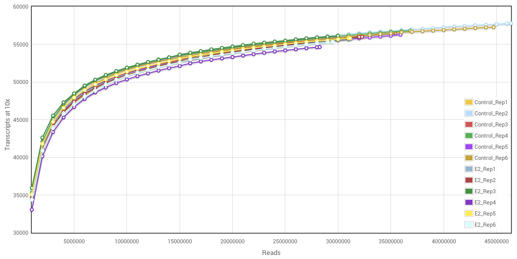
Reading a saturation curve is straightforward. The number of reads sequenced are on the x-axis, the number of transcripts detected* is on the y-axis and each sample that was sequenced in the experiment** has a curve on the plot.
What can we learn from looking at this graph? Qualitatively, we can see that the samples are largely saturated. That is, they reached a plateau, where additional sequencing would only marginally increase the number of transcripts seen. For example, if we look at the difference between 20 million reads and 40 million reads, only about 5000 more transcripts are seen. So, twice the amount of sequencing (and twice the price) yields only 10% new information.
Now, some of you no doubt are saying, “But Dave, being able to get good measurements on rarer transcripts (that last 10%) is actually relevant for many studies.”, and of course that’s true. The important thing is being able to measure how deeply you’re interrogating the transcriptome, which is the quantitative aspect of the saturation curve. It answers the question: how many transcripts do we see in each sample for a given amount of sequencing?
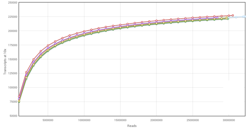
Here’s another saturation curve. This one illustrates the ideal case: all of the samples are saturated, all were sequenced to the same depth, and everything is nice and uniform. Note here that the number of transcripts seen plateaus out at about 23,000, where the previous graph the plateau was over 50,000. This shows another useful feature of saturation curves: we can assess the complexity of the sample. We know that certain tissues or cell types (like the brain) are highly complex, with many transcripts being expressed, whereas other such as smooth muscle express relatively few genes.
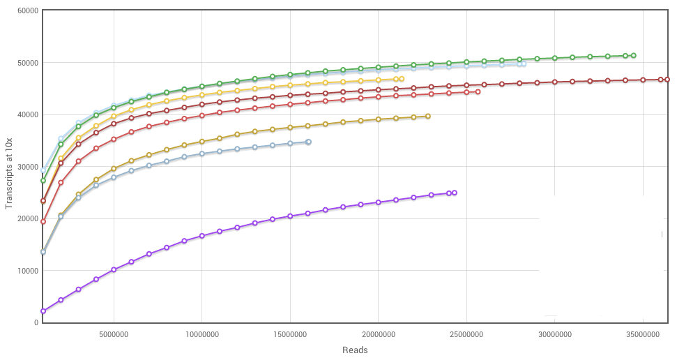
Now that you’ve seen a couple of saturation curves, what do you think of this one? Kind of a mess, right? Few of the samples have plateaued, the relative amounts of sequence per sample are uneven, and then there’s that purple curve out at the bottom, away from all the other samples. What’s going on there? It could be a real biological difference. Imagine you’re working with a primary carcinoma, which is often a heterogeneous mix of cells — it’s hard to maintain even cell composition when dissecting multiple samples.
What are the other possible explanations? There could have been an issue during construction of the cDNA library or other phase of the sample handling process. There might have been a problem on the sequencing machine. From this graph alone, it’s not possible to distinguish between these possibilities, and regardless of the reason, I would recommend withholding that sample from comparison, as detecting any differential expression would be difficult due to the bias.
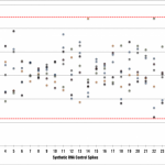
That being said, there are ways to investigate the source of the bias. At Cofactor, we use molecular spike-ins, added into the sample prior to library construction, to allow us to diagnose whether what we’re seeing originated with the sample or with the library. Similarly, we run controls in every sequencing lane to validate the sequencer is performing as expected. These controls, along with saturation curves, all work together to make it possible to get a complete picture of what’s going on with your experiment and to allow us to actually see whether your experiment was successful from a QC and experimental design perspective.
* More precisely, the number of transcripts detected which have at least 10 reads mapping to it. We use this fairly stringent cutoff to avoid low-frequency noise from inflating the estimate . We wouldn’t use transcripts with <10 mapped reads in a differential expression experiment, so why count them in a saturation curve?
** These samples happen to be from a publicly available human dataset from Kevin White’s group at the University of Chicago, comparing breast cancer tumor cell line MCF-7 (Control) with estrogen-treated MCF-7 cells (E2).