Part 6 of our 6 part series on RNA-seq. Part 1, Part 2, Part 3, Part 4, and Part 5
6. Understand where the noise threshold is in your RNA-seq data.
This one today will be short…. we are in the home stretch on this 6 part series.
Number 6 is one of the largest areas of confusion I see amongst researchers we work with. They may find 100 differentially expressed candidate genes from an RNA-seq project, however 70% may be genes with very low coverage and at that level, small differences in coverage will show great differences in log2 ratios (and no one wants to spend money on validating 70% false positives from RNA-seq, we would consider this a fail).
Once you are able to define a noise cutoff for your data, you’ll be much farther along to determining true positive, statistically significant candidates in your RNA-seq experiments.
One technique we use at Cofactor to understand the level of biological noise is to plot the expression of genes between biological replicates. By applying some math, which is beyond the scope of this post, we are able to determine the cutoff point where the data diverges so much that real candidates cannot be “teased” away from the noise. We are able to apply this noise cutoff filter during data interrogation in ActiveSite, to make sure we are not considering false positive candidates, by using the “Expression Sum” field.
First, let’s see what an unamplified biological replicate plot looks like.
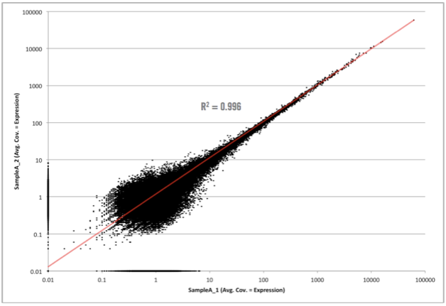
Not too bad! As you can see here, we have simply plotted the level of coverage (coverage = total number of read bases aligned / length of transcript reference in bases), for each transcript, between biological replicates. RNA-seq data will always contain biological noise in the data. There will also be technical noise, however in next-generation sequencing data, we do not normally take great steps to control for this since the largest variability comes from biological noise. At lower coverages, there will also be sampling noise, which can be seen in this graph at 10 and below (some of this includes biological noise as well). Since both biological and sampling noise play a role in RNA-seq data, it is best to filter this noise prior to selecting differentially expressed candidates. As I mentioned above, at Cofactor we allow our clients to filter the noise component when using our ActiveSite interface. So, what area of the graph above contains the noise? Check out the graph below which shows the area of noise in red.
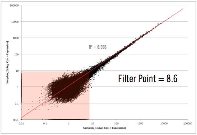
As you can see in the graph above, the filter point for this data would be 8.6, or simply rounding up, 9. This means that any transcript, with less than 9 reads aligning across all samples, would be hidden from the final output. We don’t remove it from the data set in case someone wants to really dig around in the “sandbox” (and scientists, including myself, love to do this). However, we won’t have any confidence that differential expression changes of those transcripts, exhibited between sample groups, are real (they could simply emanate from sampling or biological noise).
With amplified samples (ex. low input or single to multi-cell samples) this noise level increases due to the molecular manipulations needed to get them on a sequencing machine. Usually to around 20. One of the main points though is that the noise level changes from experiment to experiment and is based on many factors (cell state, experimental design, molecular manipulations, etc.) and needs to be determined empirically not theoretically. Interestingly, after hundreds of RNA-seq experiments, we find that a sufficient yet slightly conservative noise cutoff level is around 10. This is great because it allows us to guide our clients about how to employ this cutoff for nearly every experiment they will have in ActiveSite.
One of the other advantages with using biological replicate plots to determine noise levels is that it gives insight into what your experiment/samples looked like (how well should I trust my experimental results). The graph below shows data, generated elsewhere, received from a client to analyze using our RNA-seq analysis service.

Wow!!! Different story here…. There is something going on VERY bad here. This could be due to problems with the sample, library construction, or sequencing. Needless to say, after seeing this, we informed them that it would be very hard to trust ANY differential expression candidates coming from this data. As I mentioned, we didn’t have a hand in running these samples or generating the data, but if we did, we would go back to square one and help them obtain some usable candidates.
Well everyone, it has been a great week and I am bushed! I am not used to writing this much, however plan on doing it more often (because I REALLY like to tell everyone what I think). So until next time…. c’est la vie!
Jon