The Dashboard page is the first thing you’ll see when you open your Activesite URL. It contains basic QC information and is intended to give you quick sense of the quality of the sequencing data produced.
Near the top of Dashboard is a row of colored boxes, each one reflecting a different QC metric.
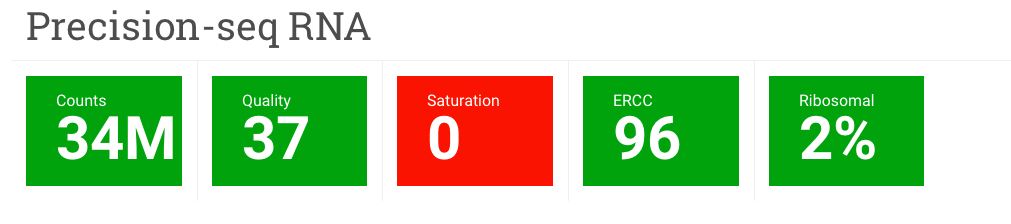
Counts – This is the average number of reads per sample in millions.
Quality – This is the phred quality score for all samples in the experiment averaged over all positions in the reads. Click on the Quality box to see plots of phred quality scores at each position in the read for each sample in the experiment.
Saturation – This metric goes with the Information Saturation plot that is a little further down the page. The number in this box represents the number of samples in your experiment that have reached saturation. More on this in the Information Saturation section.
ERCC – Sometimes as part of the experiment, artificial RNAs are spiked into the RNA-seq libraries in known amounts and then aligned to an ERCC reference. Those alignments are then used to calculate a Pearson correlation coefficient for each sample. The number you see in the box is the average Pearson correlation coefficient for all samples.
Ribosomal – This is the average ribosomal content for all samples.
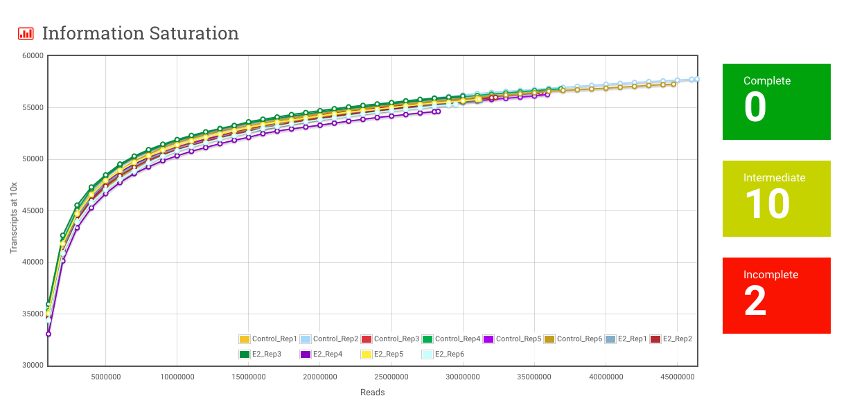
Information Saturation – For a given sample, transcripts at 10x is the number of transcripts that have at least 10 reads aligning to them. As more and more reads are sampled, the number of transcripts at 10x goes up, but it doesn’t go up forever. Beyond a certain depth of sequencing, you aren’t really seeing any more transcripts, and the curve flattens out. This plot, and the Complete, Intermediate and Incomplete metrics are meant to give you a sense of whether the amount of sequencing done adequately captures the diversity of transcripts present in the sample.
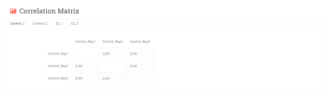
Correlation Matrix – These are matrices of Pearson correlation coefficients comparing samples from within the same group. Notice that each group has its own tab.
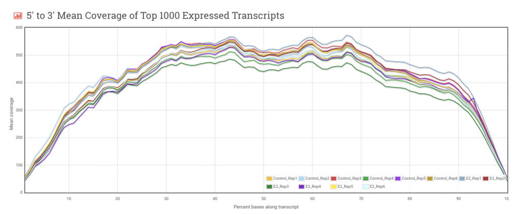
5′ to 3′ Mean Coverage of Top 1000 Expressed Transcripts – This plot is useful for evaluating coverage along the length of a transcript. Generally, the more even the coverage, the better. Irregularities in the Mean Coverage plot could reflect biases in the preparation of the RNA-seq library and these biases could affect downstream analysis.
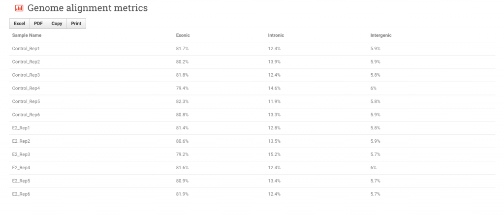
Genome alignment metrics – These fields show where within the reference genome the reads from each sample are aligning: exonic, intronic or intergenic. Note the options to export the data to Excel and PDF formats.
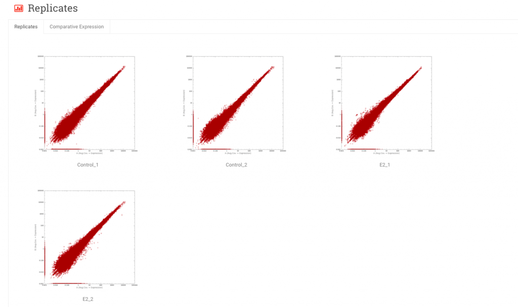
Replicates – These are scatter plots of expression values (typically RPKM) of one sample versus another. In the Replicates tab, samples from the same experimental group are plotted against each other. In the Comparative Expression tab, samples from one experimental group are compared to samples from another group.
